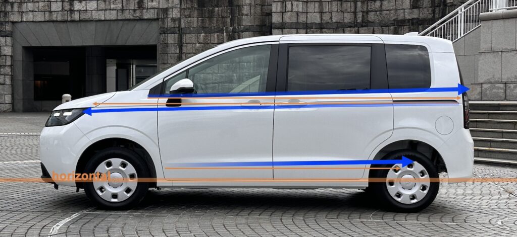
ホンダ新型FREED(フリード) ◆No.1_エクステリアデザイン Honda’s new FREED ◆No.1_Exterior Design


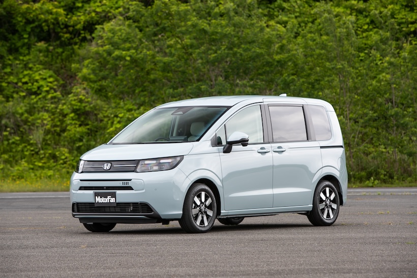
本田技研工業株式会社(Honda Motor Co., Ltd.)は6月28日に新型FREEDを発売した。2008年に初代、2016年に2代目が発売され今回で3代目となる。今回のコンセプトは”Smile” Just Right Mover (“スマイル” ジャスト ライト ムーバー)。人びとの暮らしだけではく、使う人の気持ちにも寄り添い、日々の暮らしに笑顔をもたらすクルマとなることを目指して開発した。さらに3WAY Universal Moverとして「日常使い」「レジャー使い」「介護使い」を定め、用途や手段を選ばずに快適に使える「標準車」を超える車を目指した、としている。
売れている車のモデルチェンジは難しいのだが、どのように目標を設定し開発を進めたかを開発者に聞いた。No.1_エクステリアデザイン、No.2_インテリアデザイン、No.3_介護使い、の3回に分けてお届けする。
Text:難波 治 Photos : Honda, Motor-fan, The Creative Commons Attribution, Osamu NAMBA
Honda Motor Co., Ltd. launched the new FREED on June 28, the third generation after the first generation in 2008 and the second generation in 2016. The concept of the new car is the “Smile” Just Right Mover. It was developed to be a car that brings smiles to people's faces, not only in their daily lives, but also in the feelings of those who use it.
The company has also defined the 3-way Universal Mover as “for daily use,” “for leisure,” and “for nursing care,” aiming to create a vehicle that is more than a “standard car” that can be used comfortably for any purpose or means.
We asked the developers how they set their goals and proceeded with development, although it is difficult to remodel a car that is already selling well. This issue will be divided into three parts: No.1_EXTERIOR DESIGN, No.2_INTERIOR DESIGN, No.3_CARE USE.
Text:Osamu NAMBA Photos : Honda, Motor-fan, The Creative Commons Attribution, Osamu NAMBA
3代目は方向変換?
いつの時代も人気車種のモデルチェンジは難しい。しかもユーザーの日常の生活の場面に近いモデルは余計にそうだ。できれば引き受けたくない、というデザイナーのジョークもよく語られる。
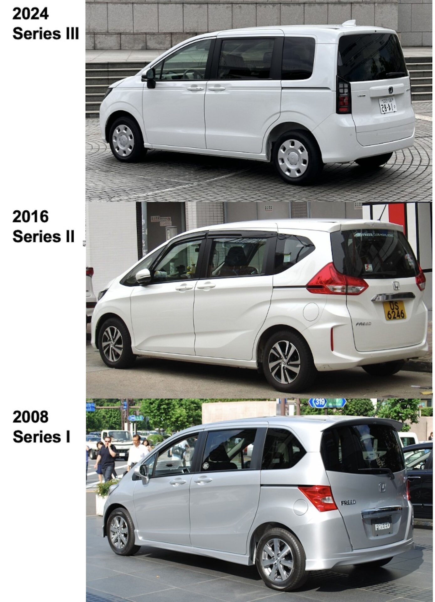
「初代、2型は自分を大きく見せたいというような10年前ぐらい前の価値観だった。もう少し自分を出す、出したい、表現したいというのが10年ぐらい前の価値観だったと思うが今は違う。それでもクルマとしてのベースがしっかりと考えられていたのでこれまでのデザインももったのだと思う」と語るのはデザインを担当した織田達哉氏*。確かに初代FREEDが出たのは2006年であり、そこからクルマの開発にかかる時間を遡ると2000年初頭の世代価値観がベースとなって開発されていたと考えられるので、その後20年余りを経て世代価値観が変化するのは当然である。
「今の若い子育て家族世代の価値観は、自分が気に入れば長く使用し、過度に加飾みたいなものはいらないという世代に完全に切り替わっています。彼らの感性はその方向に完全にシフトしていて、そこにブレはない。いいものを長く持ちたいという気持ちが土台にあり、自分を大きく見せたいとか、そういう感覚もまったくない。素直な感じで。新型はそこを表現させたいと考えた」と織田氏は言う。
*織田達哉氏:株式会社本田技術研究所 オートモービルセンター デザイン室 プロダクトデザインスタジオ研究員 デザイナー
それでも外観の見た目は商品の「人気」の大きな要素であり、成功している見かけの印象を変化させるのは実は怖いものだしチャレンジである。事実2型のFREEDは初代の進化系のスタイルを纏っていた。その部分についてこの新型の開発をまとめたLPL(Large Project Leader)の安積悟シニアチーフエンジニア*は「過去2代はウェッジを効かせ、軽快感とかスポーティな印象を持たせていた。エクステリアもインテリアも惹かれる部分や、造形美でやってきました」
「今回もその延長線上で行くとなると、これまででかなり行きついた状態の価値の捉え方だとか変化の捉え方のをさらにやろうとすると、今度はフリードを買っていただけるお客さんの枠を超えてしまって、難しいデザインになってくるんじゃないかと思った」
「今のお客さんの志向性というか、ファミリー層を考えた時に、例えばものすごいグリルをつけて、メカメカしいものにしていかないと、となると多分さらに次のステップになり得ないようなところに行ってしまう。そうなった時に、それが本当にフリードなんですかとなる」
「フリードはものすごく息が長い商品。より生活に寄り添う、飽きの来ない、生活の中に溶け込むということを考えた時に、いっぺん元に、原点に戻り、造形美というよりも、佇まいとかスタンスだとか、そういうところのベースに戻った方がいいんじゃないかということで、まずフォルムとスタンというところから入ってもらった」と語った。
*安積 悟氏:本田技研工業株式会社 BEV開発センター 統括LPL シニアチーフエンジニア

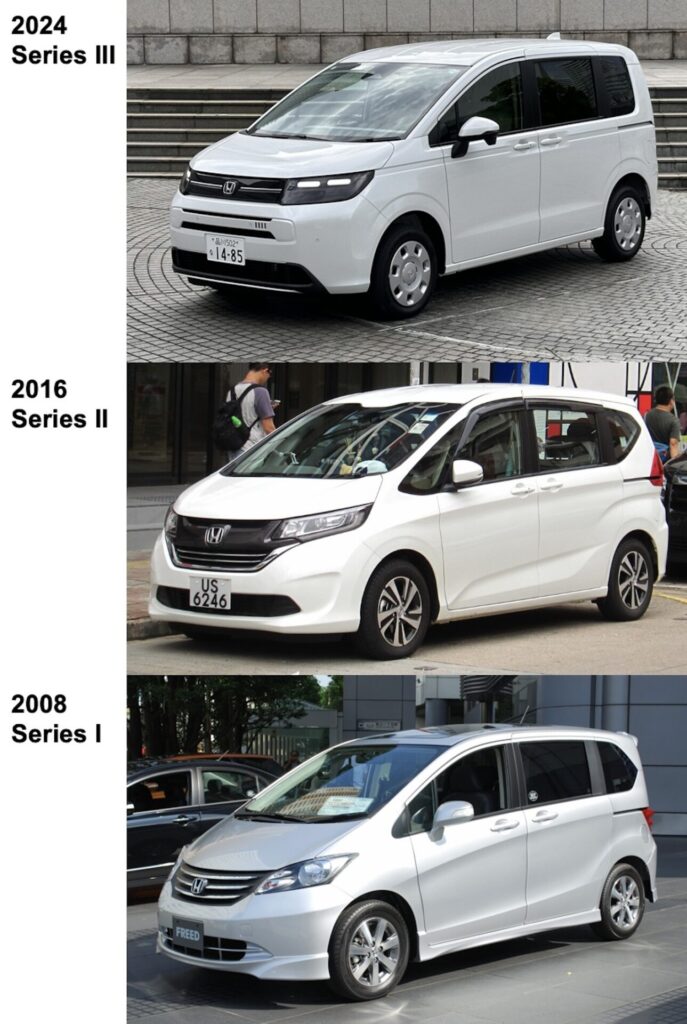
先代まではノーズとフロントウィンドウが連続したワンシェイプのプロポーションで、ウェッジ感をきかせてスポーティさと先進感を主張したスタイリングを継続してきた。初代開発当時すでに新たな価値観を提示していたメルセデスAクラスの影響を強く受けているように思われるスタイリング。
PHOTO :Series I_Honda Series II_Motor-fan
「そこでやっぱりパッケージとしてまずちゃんと外から見ても使えるように見えるっていうのはひとつプロダクト製品として大切なところなので、まずパッケージが見えるデザインとしました」
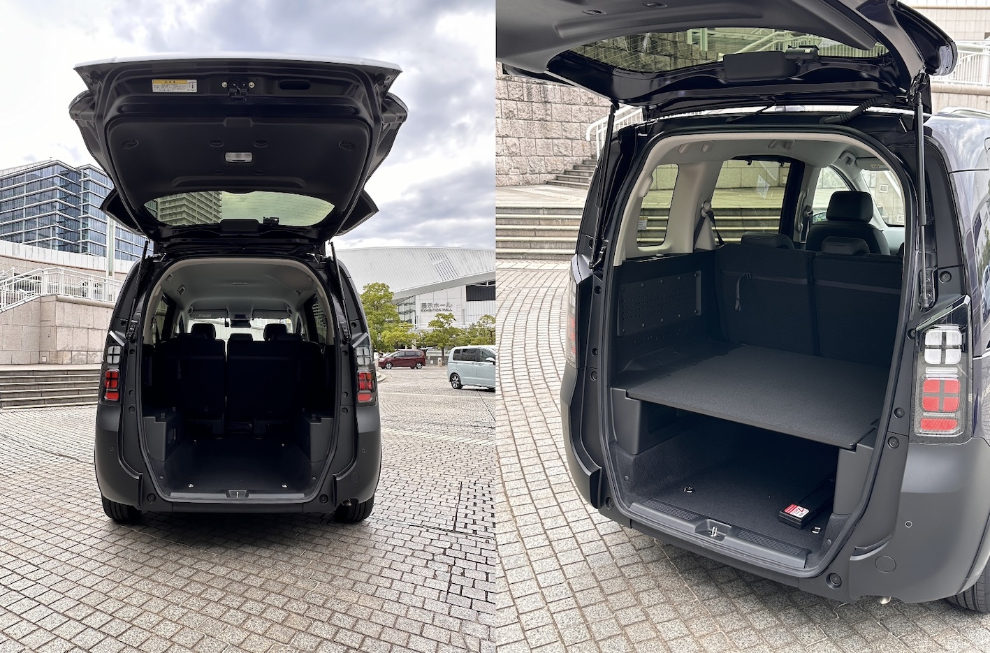
「パッケージをしっかりやった上で、コンパクトでモノを積めるという表現に加え、スタンスが良くて走りそうに見えるというような部分や、動きがあると感じる部分などをミックスした」と織田氏は語る。その上で家族が気持ちよく乗れるクルマということで開発チームには「3列まで気持ちよく乗れるという共通意識がありました。 ホンダはご存知かもしれないですけど、パッケージも含めてデザイン部でかなりやっていて、その部分でスタイリングとパッケージとが合体できていたということだと思います」と語られた。

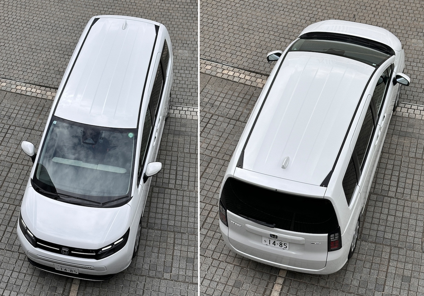
今回の造形の最大の特徴は先代までのワンシェイププロポーションに対して「ノーズがある」という意識を持たせることで人々の意識下にある「車らしさ」や「安心感」を想起させることを優先している。ボンネットという部分の存在を明確にし、ノーズもある程度の高さ位置を保つことで、安定感や頼りがいを醸し出すことに成功している。またこれまでの典型的なクルマらしさを感じさせることで従来車に対する一格上の車格感と上質な感覚を持たせたと思われる。実際にドライバーズシートから感じる前周りの存在感は先代では感じられない「なんとなく安定感」を感じさせるもので、そこが先代の最大の弱点だったのかもしれない。

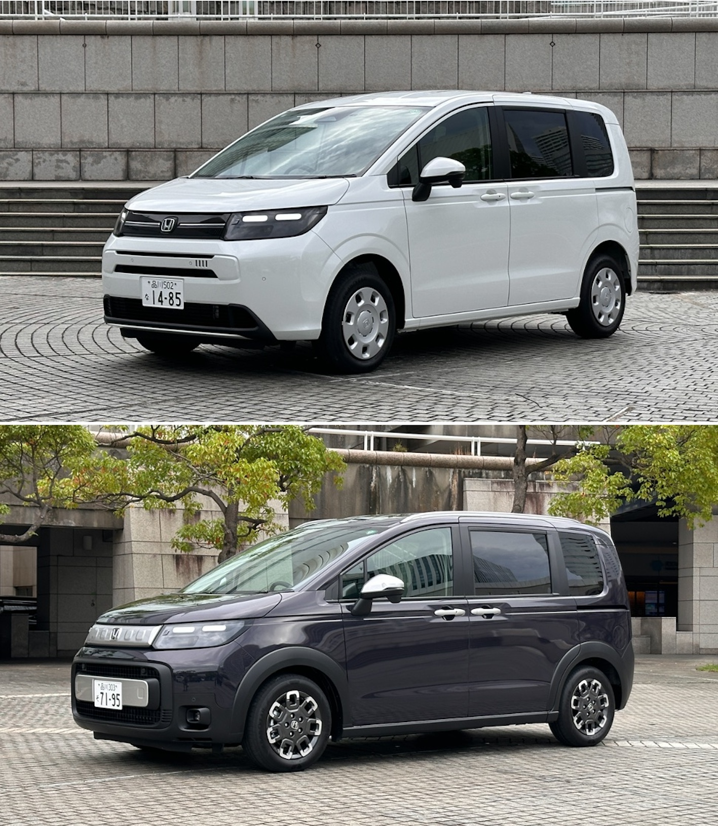
エアとクロスター
今回のフリードは標準的なエアとアクティブな姿を纏うクロスターの2タイプが存在する。そのデザインの振り分けについてLPLの安積氏は、
「今回のエアとクロスターは大きく方向性を分けようという目標が元々ありました。ふたつのラインをしっかり持とうということで、エアの方はいろいろな人たちの生活に溶け込めるようなシンプルさとかクリーンさとかをしっかりと出す。クロスターの方は遊んでいいよ、できるだけ元気よく力強くやっていいとして、そこを分けられたのが、思い切って振ることができた理由かもしれません。」と語る。

クロスターはエアのプレス部分(鉄板部分)を共通にして前後バンパー、フロントグリル、ホイールアーチ周囲のクラッディングパーツなどの樹脂部分を専用デザインとしている。
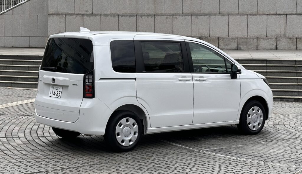
SIDE
オレンジ線は全て水平。ブルー線はそれを示すキャラクターラインのウェッジ角度。水平基調に見せるためには水平線は使えない。わずかにウェッジ角度をつけることで水平印象だが動きを感じることができる。
中央のプレスキャラクターラインは、ヘッドランプから後端の水平なスライドドアレールに結び込むカーブでできている。

基本ボディに付加物を付けることで縦方向に視線が動くことで、厚み感、しっかり感を感じさせる。その意味でもルーフレールは視覚的な役割も大きい。人は見ているモノの上背が高くなると実寸以上に大きさを感じるからだ。ホイールデザインも直径を大きく見せるようにデザイン要素を外周に寄せている。
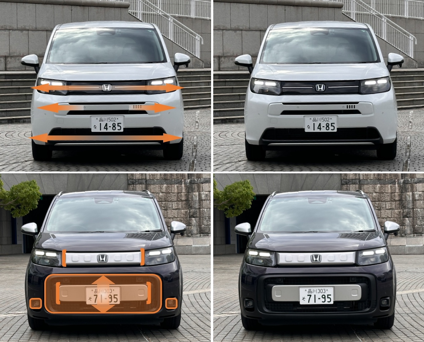
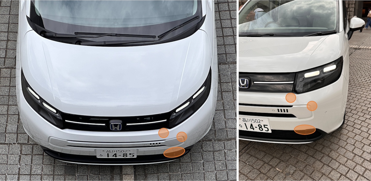
FRONT

エアは全幅と全高がほぼ同寸のスクエアな正面視において、可能な限り左右方向の要素を用いることで、横方向の幅を実寸以上に意識させたり、水平安定感を感じさせるように仕向けている。グリル+ヘッドライトが高い位置にあることも重要だ。このおかげでフロントに厚み感がでて、頼りがいや安心感を感じさせることにつながる。
クロスターはエアと同じ寸法のボディでありながら、視線の移動を一定の幅で止めることと、スクエアなグラフィック要素を多用することで、高さ方向と強さ感(防御感)、安心・安全感を感じさせている。
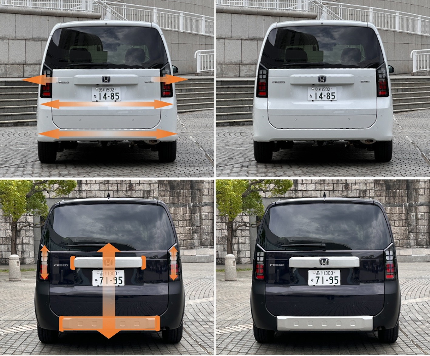
REAR

正面と同じ視覚効果をフルに使用している両者。エアは左右方向へ視線を促し、クロスターは縦方向、厚み方向を感じさせる構成にしている。エアのバンパー左右下端コーナー部の小さなディティルも背の高いFREEDの不安定さを払拭させる役割を担い、またクロスターのバンパー下部の金属調のアンダーガード的グラフィック処理が低重心やアクティブさを感じさせている。
エアとクロスターの造形は特別に凝った難しいことはしておらず、セオリーに沿った対応をして、それぞれの商品特性に求められる見栄えを確保している。派手さは無くどちらかといえばスタンダードな大人しいデザインになっている。
そのおかげでエアとクロスターはそれぞれに商品魅力価値を身に付けることが可能であり、それぞれの商品目標への表現ができているし、双方ともに落ち着いた佇まいと質感の高さを感じることができている。
タイヤとボディのバランスも良く、足元がプアに感じることもない。内部のスペース最重視とはいえ、その外観が商用バンのような平坦な板に見えることもなく適切なプランカーブを用いている。フロントのコーナー、角度をつけたバンパーにも造形の工夫があり、それとフロントのモチーフを上手くあしらっている。


大きなストロークのカーブとそこからつながる前方へ(後方へ)のフォローカーブを見る事ができる。これによって車体がただの箱に見えないようになっている。非常に巧みだ。

No.2_インテリア デザインにつづく
Honda’s new FREED ◆No.1_EXTERIOR DESIGN

Third generation change of dierection?
It is always difficult to change the model of a popular car. This is especially true for models that are close to users’ daily life situations. The joke is often told by designers that they would not want to take on the job if they could.
“In the first and second generation, the values of about 10 years ago were to make yourself look bigger. I think the values of about 10 years ago were to put yourself out there a little more, to put yourself out there, to express yourself a little more, but now it’s different. Even so, I think the design has held up to date because the base of the car was well thought out.” Mr. Tatsuya Oda*, who was in charge of the design, says so. Indeed, the first FREED came out in 2006, and if we go back the time it took to develop the car from that point, we can assume that it was developed based on generational values in the early 2000s, so it is only natural that generational values would change over the next 20 years or so.
“The values of today’s generation of young families raising children have completely switched to a generation that will use a product for a long time if they like it and do not want anything that is overly decorative. Their sensibility has completely shifted in that direction, and that is not blurred. The foundation is the desire to have good things for a long time, and there is no sense of wanting to make oneself look big or anything like that. It’s very straightforward. We wanted the new model to express that.” Oda said.
*Tatsuya Oda: Senior Designer, Product Design Studio, Styling Design Division, Automobile Center
 Honda R&D Co.
Still, the external appearance is a major factor in the “popularity” of a product, and changing the successful apparent impression is actually scary and a challenge. In fact, the Type 2 FREED wore the evolutionary style of the first generation. Satoru Azumi, Senior Chief Engineer* of LPL (Large Project Leader), who has been in charge of the development of this new model, said, “In the past two generations, wedges were used to give the car a light and sporty impression. We have used attractive detailing and formative beauty in both the exterior and interior.
“If we were to continue along the same lines this time around, I thought that if we continued with the approach to value and change that we had already reached so far, we would exceed the boundaries of the customers who buy Freed, and the design would be difficult to implement.”
“If we had to add, for example, a huge grille and make it mechanical, we would probably end up in a place where we could not take it to the next step. If we do that, then the question becomes, “Is that really a Freed?”
“Freed is a long-lasting product. When we thought about how we could make Freed more accessible to people’s lives, how we could make it fit into their lives, we thought it would be better to go back to the basics, not so much in terms of formative beauty but in terms of appearance and stance,” he said.
* Satoru Azumi: Large Project Leader, Supervisor Chief Engineer, BEV Development Center, Electrification Business Development Operatons
Honda Motor Co.
2024 new model [Length 4310×Width 1695×Height 1755], 2016 type 2 [Length 4265×Width 1695×Height 1710], 2008 first generation [Length 4215×Width 1695×Height 1715].
Up until the previous generation, the styling continued to assert a sporty and advanced feel with a wedge-like appearance in one-shape proportions with a continuous nose and front window. The styling seems to have been strongly influenced by the Mercedes A-Class, which was already presenting new values when the first generation was developed.
PHOTO : Series I_Honda Series II_Motor-fan
So we decided to design the package so that it would be visible from the outside, because it is important for a product to look usable from the outside. Oda says, “After doing the package, we mixed the expression of being compact and able to carry things with a good stance, looking like it would run, and feeling like it would move.” “On top of that, we wanted a car that would be comfortable for families to ride in,
The development team had a common awareness that the car could comfortably accommodate up to three rows of passengers.” “As you may know, Honda does a lot of work in the design department, including the packaging, and I think that part of the work was to combine the styling with the packaging,” he said.
The most important feature of the new modeling is the “nose,” which is a contrast to the one-shape proportions of the previous generation, and is intended to evoke a sense of “car-ness” and “security” in people’s minds. By making the presence of the hood clear and maintaining the high position of the nose, it succeeds in creating a sense of stability and dependability. It also has a typical car-like appearance, which is thought to give the car a higher-class and higher-quality feel than its predecessors. In fact, the presence of the front area felt from the driver’s seat gives a sense of “stability” that was not felt in the previous generation, and this may have been the greatest weakness of the previous generation.
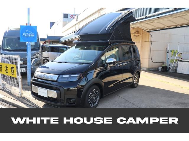
AIR and CROSSTAR
This time, there are two types of FREED: the standard AIR and the CROSSTAR, which wears an active figure. On the sorting of its design “Our original goal was to separate the two major directions for this AIR and CROSSTAR. The idea is to have two firm lines, so the AIR one will be simple and clean enough to fit into the lives of many different people. CROSSTAR is fine to play around with, as long as it is done as vigorously and powerfully as possible. Being able to separate that was probably the reason I was able to swing so boldly.” says Mr. Azumi of LPL.
The CROSSTAR shares the same pressed parts (Sheet metal parts) of the AIR, but the resin parts such as the front and rear bumpers, front grille, and cladding parts around the wheel arches are exclusively designed for this model.
SIDE
Orange lines are all horizontal. The blue line is the wedge angle of the character line showing it. Horizontal lines cannot be used to create the appearance of a horizontal base. The slight wedge angle gives the impression of horizontal but with a sense of movement.
The press character line in the center of the body is made up of a curve that connects the headlamps to the horizontal sliding door rails at the rear end.
Adding an addition to the basic body gives a sense of thickness and solidity by moving the line of sight vertically. In this sense, roof rails also play a significant visual role. When the height of the object being viewed is increased, people perceive it to be larger than its actual size. The design elements of the wheels are also placed around the periphery to make them appear larger in diameter.
FRONT
In the AIR’s square frontal view, where the overall width and height are almost the same dimension, the use of left-right elements as much as possible is intended to make the viewer more aware of the horizontal width than the actual dimensions and to give the viewer a sense of horizontal stability. It is also important that the grille + headlights are positioned high. This gives the front of the vehicle a sense of thickness, which leads to a sense of dependability and security.
Although the body of the CROSSTAR has the same dimensions as the AIR, it is designed to stop eye movement at a certain width and uses many square graphic elements to create a sense of height, strength (defensiveness), safety, and security.
REAR
Both fully use the same visual effect as the front view. The AIR’s design encourages the eye to look to the left and right, while the CROSSTAR’s design gives the impression of verticality and thickness. The small detailing on the lower left and right corners of the AIR’s bumper also serves to eliminate the instability of the taller FREED, while the metallic under-guard-like graphic treatment on the lower bumper of the CROSSTAR gives the impression of a low center of gravity and active appearance.
The modeling of the air and closter is not particularly elaborate or difficult, but rather responds in accordance with the theory to ensure the required look for each product characteristic. The design is not flashy, but rather standard and mature.
This allows AIR and CROSSTAR to wear their own product appeal value, and they are both able to express themselves to their respective product goals, and both have a calm appearance and high quality feel. This allows AIR and CROSSTAR to wear their own product appeal value, and they are both able to express themselves to their respective product goals, and both have a calm appearance and high quality feel. Even though the interior space is of paramount importance, its exterior does not look like a flat board like a commercial van, but uses an appropriate plan curve. The front corners and angled bumpers also have ingenious sculpting, and the front motifs are well applied to them.
You can see the large stroke curve and the forward (backward) follow curve leading from it. This makes the body not look like a mere box. It is very clever.
Continue to No.2_INTERIOR DESIGN
新型の関連記事

牙城は崩せるか!? 新型キックス vs ヴェゼル徹底比較! 実力伯仲のなか、価格差以上に見えた決定的な違いとは? 【新型キックス 徹底比較】

日産が新型SUV『テクトン』を発表! インド開発・世界50市場へ輸出、新たなグローバル戦略の中核モデルに!

レクサスの壁は想像以上に高かった!? マツダのプレミアム戦略はどうなる? CX-80販売データから見えてきた“最大の壁”とは? 【海外・評】

新型キックス vs ヤリスクロス徹底比較! 燃費・価格・後席・走り…本当に買うべきSUVはどっちだ!? 【新型キックス 徹底比較】

メルセデス・ベンツ新型「CLA/CLAシューティングブレーク」発売!CLAには350台の導入記念特別仕様車「ローンチエディション」を設定