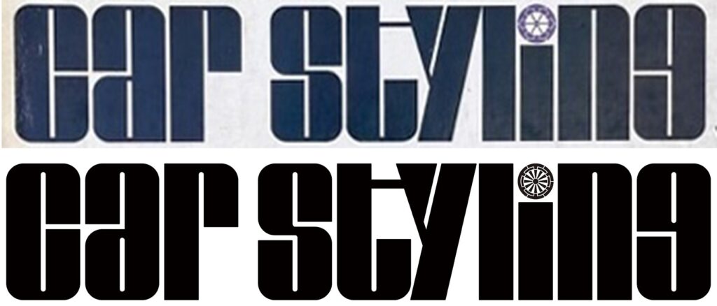
” i “の点を巡る隠されたストーリー CarStyling ロゴストーリー The hidden story behind the dotting of the ‘i’ CarStyling Logo Story

The story behind the logo design of the revived CarStyling: The logo of the first issue of CarStyling in December 1972 (titled 1973 WINTER issue) and the logo of the revived CarStyling in April 2024 are in fact different. The new logo was redesigned by Osamu Namba, Editor-in-Chief of CarStyling.
“The hidden story behind the dotting of the ‘i’ CarStyling Logo Story
CarStyling誌をご存知の方には懐かしい見覚えのあるロゴであり、初めてご覧になる方々には是非とも今後記憶に留めていただきたいCarStylingロゴ。
ほとんどの方がずっと同じだと思っていらっしゃいますが、実は創刊以来これまで小さな変化を繰り返してきています。
今回CarStylingの復活に際しては、創刊の熱意と50年という歳月に敬意を表し、また創刊時の想いを再び現代に引き継ぐことを意図し、Website版のロゴは限りなく初代イメージへと回帰しました。
しかし、実際には初代のロゴそのものではありません。パッと見は同じ印象ですがすべての文字を作り直しています。おわかりになるでしょうか。
For those of you who know CarStyling magazine, this logowill look familiar, and for those of you who are new to CarStyling, we hope you will remember it in the future.
Most people think that things have remained the same, but in fact we have gone through a series of small changessince the first issue of the magazine.

In reviving CarStyling, the logo of the website version has reverted to the original image as much as possible in orderto pay homage to the enthusiasm of the first issue and the 50 years that have passed since its launch, as well as to carry on the feelings of the first issue in the modern age.
However, it is not actually the first logo itself. It looks the same at a quick glance, but all the letters have been reworked. Can you see it?
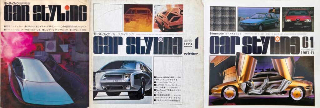
「Volume 0」1972、Aug. 「Volume 1」1972 Dec. 「volume 61」1987 Nov
1972年8月に出版された0号(モーターファン臨時増刊)でこのロゴの原型は生まれていますが、大文字と小文字が混ざっていて、その規則性も見えません。その4カ月後の12月に出版された1号では単語のトップのCとSが大文字でその他は小文字というルールに揃えられました。
さらに一番細いラインも0号に比べると少し太くなりしっかりと見えるようになりました。創刊から15年経った1987年の60号から隔月刊になったのですが、そのタイミングでtの横棒が太くなっています。また文字の端末の角に小さなRがついて刺々しさが抑えられました。これは実はロゴデザインのセオリーでもあります。
The prototype of this logo was created in Issue 0 (extra issue of Motor Fan) published in August 1972, but its regularity is not visible due to the mixture of upper and lower case letters. Four months later, in Issue 1, published in December, the rule was aligned so that the C and S at the top of the word were capitalized and the rest were in lowercase.The thinnest line was also slightly thicker than in Issue 0, making it more clearly visible.
Fifteen years after the first issue, the magazine became bimonthly starting with issue 60 in 1987, at which time the horizontal bar on the "t" became thicker.
Also, the terminal corners of the letters have a small R on them to make them look less harsh. This is actually a theory of logo design.
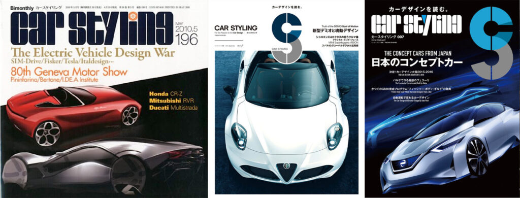
「Volume 196」2010、May 「renewal Volume 1」2014 July 「volume 13」2015 Dec.
隔月刊になった後半には表紙デザインは変更されていますが、2010年5月に出版された196号(最終号)までロゴは変更されていません。そしてここで一旦CarStylingは37年余の歩みを止めます。
そこから約4年経った2014年7月にCarStylingは再開されますが、まず大きく変わったのが本のサイズでした。また新たにCとSをひとつにまとめた’CS’というロゴマークが登場します。翌年末にはCarStylingのロゴは復活しますが、1文字の左右を繋いでいた細い線は消え、ブロックで見せるように変化し、それまで’i’の点に色を配置していたものを’y’へ変更しています。そして2019年3月のVol.20で再び休刊となってしまいました。
それから5年。CarStylingはwebで再再スタートを致します。そしてロゴは冒頭に書いたように初代へ限りなく近づきました。でもすべての文字がリニューアル。
Although the cover design was changed in the latter half of the bimonthly publication, the logo remained unchanged until Issue 196 (the last issue) published in May 2010.
And here CarStyling comes to a halt after more than 37 years!
CarStyling reopened in July 2014, almost four years later, and the first major change was the size of the book.A new logo, ‘CS’, combining the C and S into one letter, was also introduced.
By the end of the following year, the CarStyling logo was restored, but the thin line connecting the left and right sides of one letter had disappeared, and the logo was changed to a block presentation,The color that had previously been placed on the dot of the 'i' was changed to a 'y’. And with Vol. 20 in March 2019, the publication was suspended again.
Five years later, CarStyling is relaunching on the web. And as I mentioned at the beginning, the logo is as close to the original as possible. But all the letters have been renewed.
じっと見ていると少しづつ違いが見えてきますね。
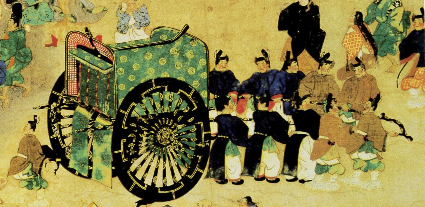
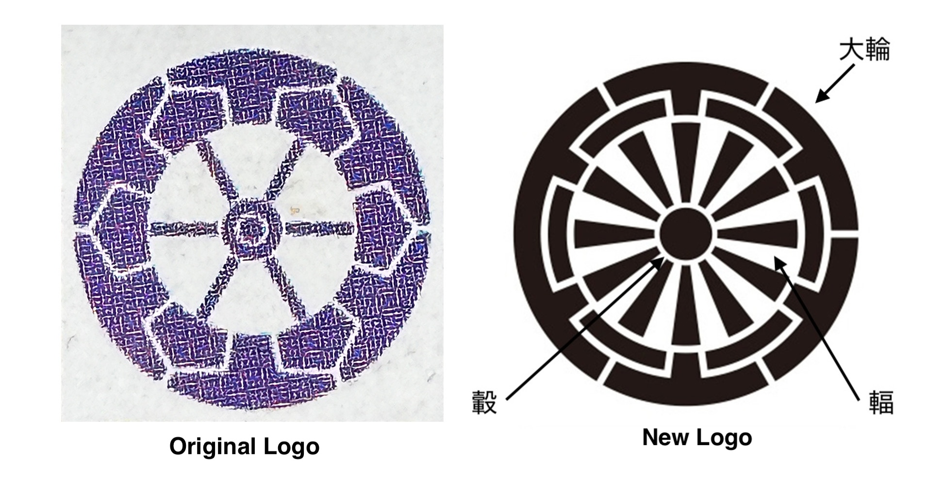
ところで小文字のiの小さな点がただの点(丸)ではないことに気付いていましたか。よく見ると細かくデザインされているのです。そしてこれは日本の平安時代に使われていた「牛車」の車輪をイメージしてデザインされたものだということがわかりました。
When we launched CarStyling, we designed and incorporated into its logo the "big wheel," which is the wheel of the first wheeled vehicle in Japan, the "hub," which is the axle, and the "spokes," which connect the wheel and the axle.
Of course, the intention was the same for this particular point,
and it was redesigned anew.
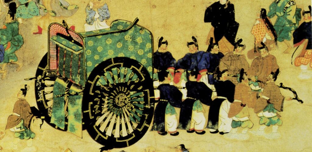
CarStylingを創刊する時にそのロゴの中に日本で最初の車輪が付いた乗り物である牛車の車輪を構成する「大輪」、軸(ハブ中心)である「轂(こしき)」、輪と軸を結ぶスポークである「輻(や)」をデザインして取り込んでいたのです。
もちろんこのこだわりの点も意図は同じくして、新たにデザインをし直しています。
When we launched CarStyling, we designed and incorporated into its logo the "big wheel," which is the wheel of the first wheeled vehicle in Japan, the "hub," which is the axle, and the "spokes," which connect the wheel and the axle.
Of course, the intention was the same for this particular point,
and it was redesigned anew.

50年の時を経て新たなスタートはwebsiteにはなりましたが、根底にある思いは変わることなく、しかし時代の求めに応じた変化を受け入れながらCarStylingは歩みを再開していきます。
After 50 years, we have made a new start with our website.
CarStyling will resume its progress, accepting changes in
response to the demands of the times.